ScaleGrowth
At-a-Glance
Design Process
Qualitative User Interviews
I executed 3 rounds of user research, conducting moderated interviews with 6 representative communities, and interviewed 12 participants in total. Post-interview, I created an affinity map to identify recurring themes and pain points.
2. Define
Top Insights
User research revealed the need for actionable CTAs to make data meaningful, and that the dashboard should streamline common tasks like event creation, forum posting, and community messaging. The clutter in the current design was also evident, highlighting the need to simplify the UI.
Persona
Through research, I developed a persona named Katrina. She represents typical community owners who have limited time and seek user-friendly features to swiftly assess community health and proactively address issues or growth opportunities.
Team Collaboration
I generated many ideas after asking myself several “How Might We” questions. I then shared my research findings and ideas with the team, and learned about additional engineering constraints and business goals, which led to subsequent collaboration with engineers to pinpoint high-value community engagement features.
Working with a design colleague, we clarified community owner goals, crafted user stories, and determined valuable CTAs. We also explored engagement boosting methods, data visualization tools, and control settings, and grouped available data into categories (e.g., social features, platform information, content types). This helped to prioritize and organize information, establishing the dashboard's information architecture and hierarchy.
3. Ideate
Task Flow
After brainstorming potential features to address the challenges users face, I organized the flow and information architecture around those ideas using 2 task flows.*
Task 1: New member application
A banner notifies the community owner of new membership applications, allowing them to quickly view and take action by accepting, declining, or messaging the applicant directly from the dashboard.

*These task flows are currently not feasible due to engineering constraints and are planned for later phases, as per the product roadmap after discussions between me and the CTO/PM. As a result, they are not included in the wireframes.
Design Systems
I leveraged ScaleGrowth's existing style guide and pattern library, incorporating their fonts and colors while developing additional components and designs based on their atomic design system.
Accessibility
Color-blind tests revealed that certain colors in the line graph were indistinguishable for color-blind individuals. To address this, I provided engineering notes to incorporate texture and shapes into graphs for enhanced accessibility. Additionally, I adjusted the primary and secondary colors in the existing design system to formulate a new color palette dedicated for graphs, improving the readability and accessibility of graphs.
Wireframes
To serve busy community owners, I crafted dashboard wireframes that emphasized visual hierarchy, organization, simplicity, and clarity. I began with 7 rounds of initial sketches and product discussions with my team, followed by 4 rounds of Mid-Fi to Hi-Fidelity wireframes. After user testing, I made 4 additional iterations based on feedback before finalizing high-fidelity wireframes for an MVP.
4. Test
Based on user testing outcomes, I compiled a table mapping feedback and revised the wireframes accordingly. While users praised the new design vis-à-vis the original dashboard, they wanted even clearer explanations, more straightforward navigation, and enhanced infographics.
Design Changes
Simple, Clear, Visually Appealing Data:
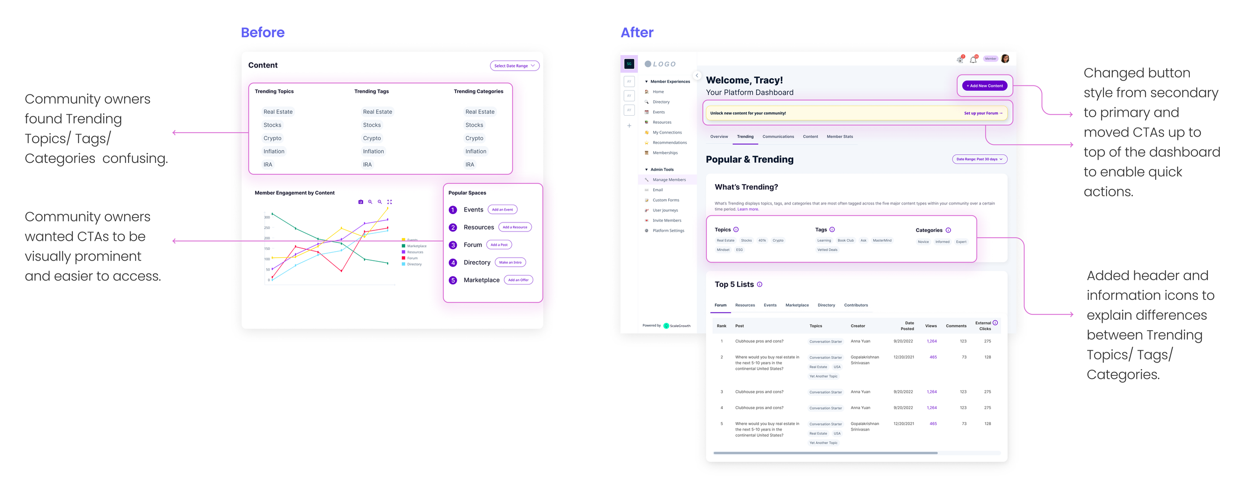
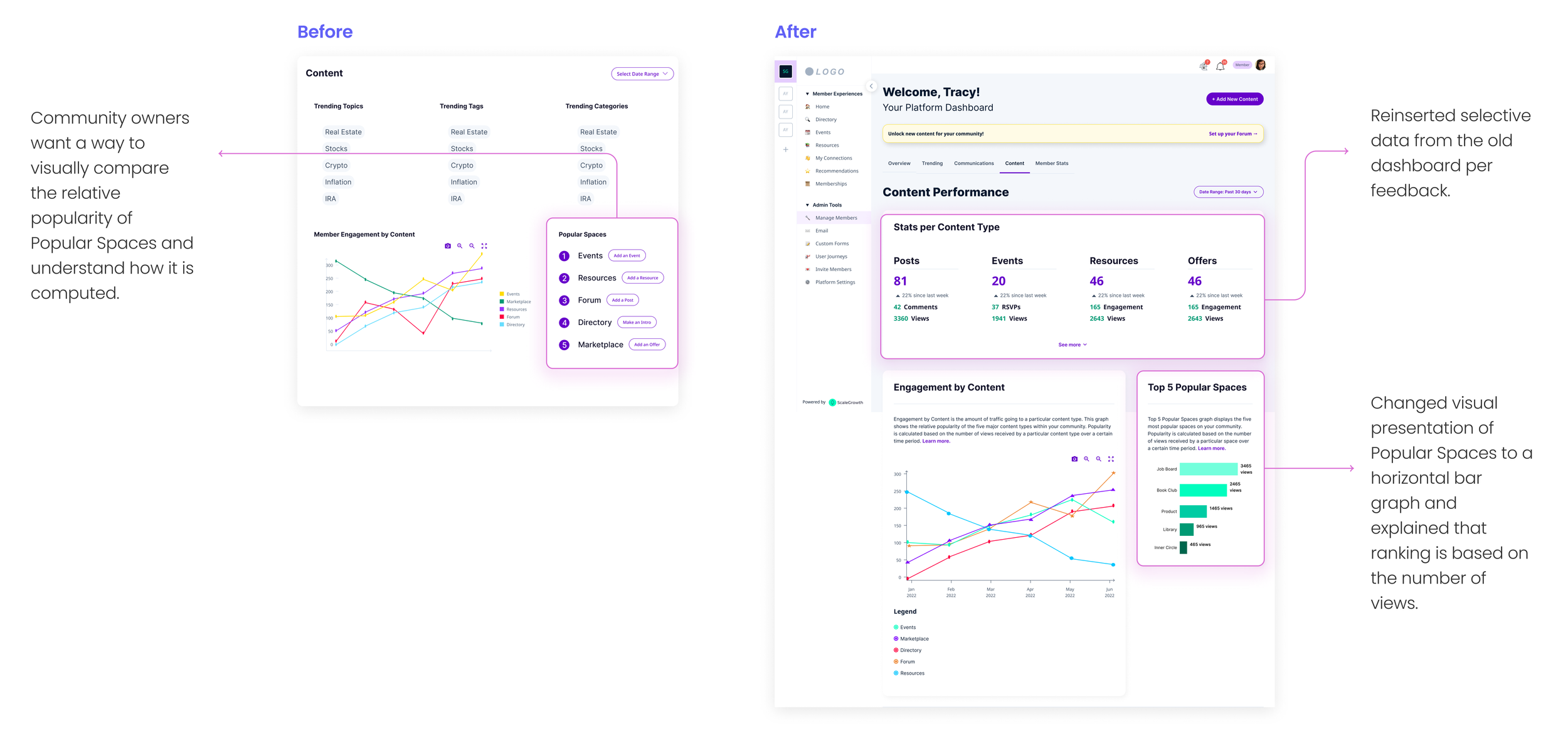
To make the data more understandable, I incorporated easy-to-read graphs, charts, and tables. I simplified terminology, added information icons and modal popups for unfamiliar terms, and included links to an FAQ article with guidance and tips for community owners.

Prominent CTA Buttons for Increased Engagement:
I introduced a quick actions button for community owners to execute common actions like event creation and adding posts. Sharing and messaging features were added to boost engagement. New member applications were given a dedicated box for one-click review of pending applications.

Reorganized and Decluttered Space Using Progressive Disclosures:
To maintain a clean and minimalist dashboard, I employed progressive disclosures, eliminated unnecessary information, and applied visual hierarchy principles to prioritize content. Non-essential numbers and graphs were reserved for a separate data analytics page to be developed later.

Final Designs
* Designed for smallest mobile screen to make sure the design will work on even the narrowest of constraints.
5. Grow
Less is more. Removing info and options can reduce cognitive load and error rates.
Meaningful data needs actionable CTAs. Engagement increases when the distance between insight and action decreases.
Problems are opportunities in disguise. Every challenge is a chance to increase user satisfaction.
Pragmatism wins the day. Design needs to flex around engineering constraints at startups.
Surprisingly, the biggest learning came post-design:
I wanted to see faster engineering progress and pondered how best to communicate and advocate for the user on behalf of the design team.
I decided to initiate discussions with intent to better understand the engineering workload and priorities.
Result:
Uncovered broader process issues.
Deepened my understanding of startup pressures.
Strengthened relationships in the long run.
I am deeply indebted to my business, engineering and design colleagues for their invaluable input and support.


