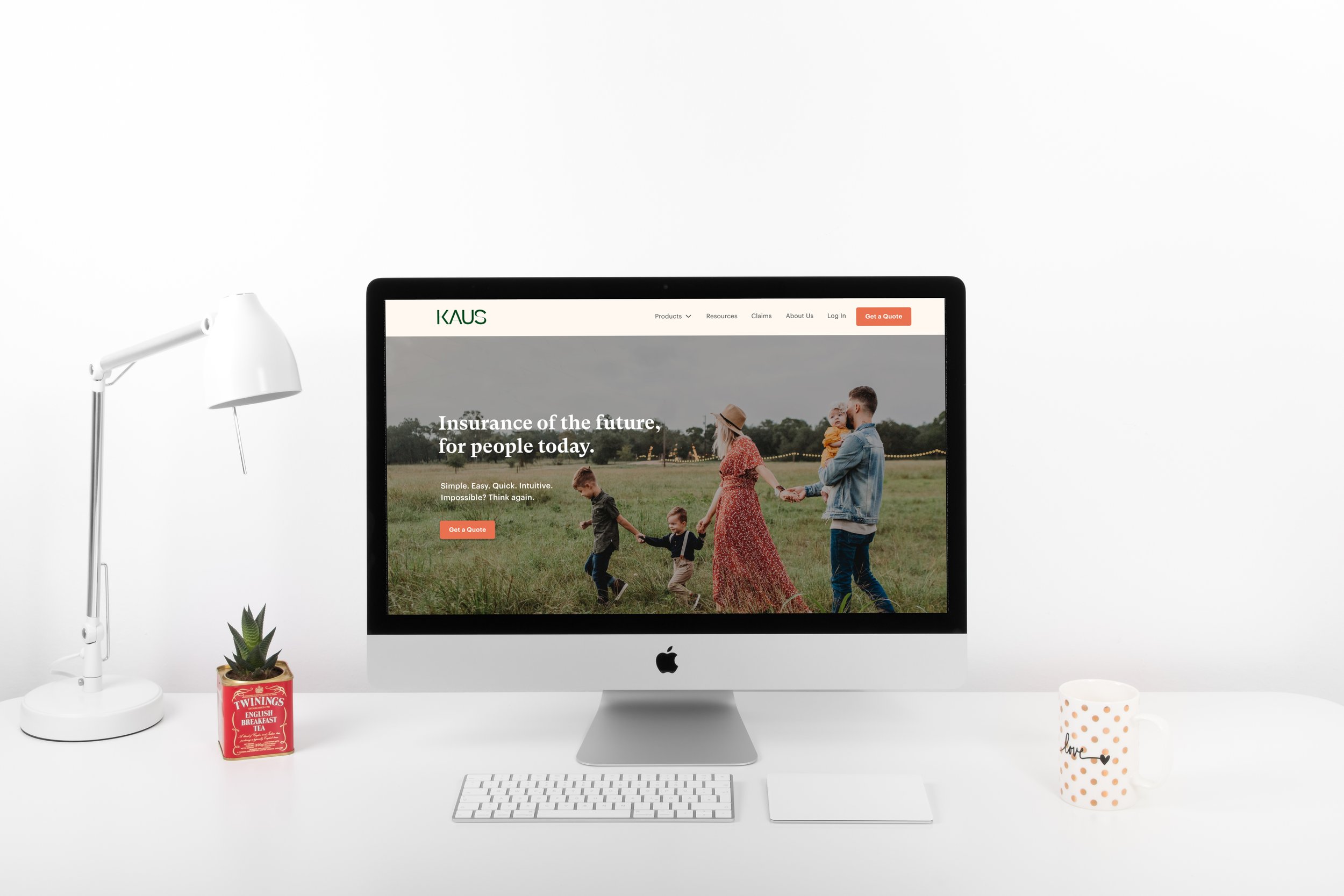
Kaus Insurance
Timeline: Spring 2022
Role: Solo designer
Work Product:
Responsive website design
Research
Branding
Prototyping
Usability testing
1. Project Overview
2. Research
Market Research
I conducted a thorough analysis of competitor websites and apps to gain insights into the current insurance market.
Based on my research, I identified features that resonated with millennials and incorporated those design elements into my brand redesign, website content, and information architecture.
My focus was on creating a user-friendly interface with a clear visual hierarchy, an efficient quote process, vibrant graphics, and content that emphasizes convenience, social proof, and customization.
Image: Analysis of select competitor websites
I also conducted secondary market research to gain a deeper understanding of how millennials shop for insurance.
This research confirmed many of the findings from my user interviews and informed my decision to prioritize educational resources and the ability to connect with experienced agents on my homepage.
Image: Key insurance purchasing factors for millenials from recent Liberty Mutual and SafeCo Insurance report
Qualitative User Interviews
I conducted in-depth interviews with millennials to understand their needs, wants, and pain points when it comes to buying insurance online.
Through these interviews, I learned that there is a deep-seated mistrust of insurance companies among consumers who prioritize fast, easy, and flexible insurance options.
Using these insights, I developed a task flow, wireframes, and UI design that addressed these concerns and emphasized convenience, flexibility, and educational resources to increase trust in Kaus's brand.
Top Insights
Persona Development
To fully understand the needs and pain points of the user, I created three personas and ultimately chose to focus on Koa as a representation of the target user.
Through my research, I discovered that millennials prioritize convenience and flexibility when shopping for insurance. Therefore, I designed a user-friendly interface that streamlines the quote process and emphasizes the ability to customize coverage.
Image: Primary persona
3. Ideation
Based on my research insights, I formulated three main "How Might We" questions to generate ideas that would make Kaus more trustworthy, transparent, and user-friendly for time-strapped millennials.
Brainstorm
Information Architecture
After brainstorming potential features to tackle user challenges, I used various tools to organize the flow and information architecture, including:
Card sort
Site map
User flow
Task flow for the quote process
Detailed UI requirements document
Product roadmap
Image: Task flow
Image: User flow
Visual Design
I used design to humanize insurance and build trust, such as opting for a warm, inviting color palette, playful imagery and professional yet fun-looking font.
Since the typical insurance user felt that the industry is inaccessible and inhumane from my research findings, I wanted the visual design to be fun, friendly, and approachable.
These visual design choices are reflected in the:
Brand identity
Logo design
Mood board and UI kit
Image: UI Kit
4. Solution
Wireframes
Building on the insights gained from my research, ideation, and task flow development, I integrated the themes of ease, simplicity, and clarity into my wireframes for both the homepage and quote wizard.
With a clear understanding of the user needs and pain points, I sketched out my designs and refined them using mid/hi-fidelity wireframes, ensuring that every element was optimized to provide a seamless and user-friendly experience.
Image: Rough sketches for the quote wizard
Image: Select mid-fi wireframes from the quote wizard
Image: Mid-fidelity wireframe for the home page
Features
Applying the human touch to insurance
To humanize insurance and make it more approachable, I incorporated inclusive, family-focused illustrations, playful visual elements, fun copy, and plain English into Kaus's brand identity.
Additionally, I added a live chatbot and the ability to connect with agents on the homepage, making it easier for users to get their questions answered and build trust with the brand.
Fun, fast quote process
I streamlined the quote process by integrating API technology to extract property information from public records and online sources. This allowed for a faster and more accurate quote process, minimizing self-reporting errors.
Customize coverage
I developed a risk-based tier system that allowed users to adjust coverage amounts up or down based on their individual needs. The initial quote was generated based on the user's selected risk philosophy, which was then adjusted using a slider to increase or decrease coverage amounts. This made it easy for users to see the impact of their coverage decisions on the premium price and provided them with more control over their insurance policy.
5. Refinement
User Testing
Users enjoyed the website's look and feel but needed clearer CTAs and visual cues for better user experience.
I conducted remote user testing to assess the UI and quote wizard flow and then created an affinity map of the feedback.
Insights:
everyone completed tasks intuitively;
everyone enjoyed the clean, modern UI and friendly branding; and
need to improve clarity to avoid disruptions in flow.
Based on the above, I prioritized the following key changes to smooth out interactions between screens.
6. Final Design
Video: Get a Quote prototype
Video: Homepage
7. Reflection
Learnings
As the sole designer on this project, I led the design process from research to implementation, with guidance from my mentor and support from my bootcamp peers.
I found immense satisfaction in crafting designs that bring joy and delight to users, and I relished the opportunity to create tangible awesomeness through my work. 😊
Educating users about insurance is crucial for building trust.
Although the redesign of the website helped to improve the perception of insurance companies, there is still a need for more work to be done. Expanding the Resources section of the website would be an effective way to provide valuable information to users and empower them with knowledge.
Clear IA and flow are crucial in simplifying insurance for users.
While the current prototype is a good starting point, the quote and claims process requires special attention to ensure a streamlined user experience.
Given more time, I would expand the prototype into a fully functional product and create a comprehensive sitemap to further simplify the flow of information for users.


